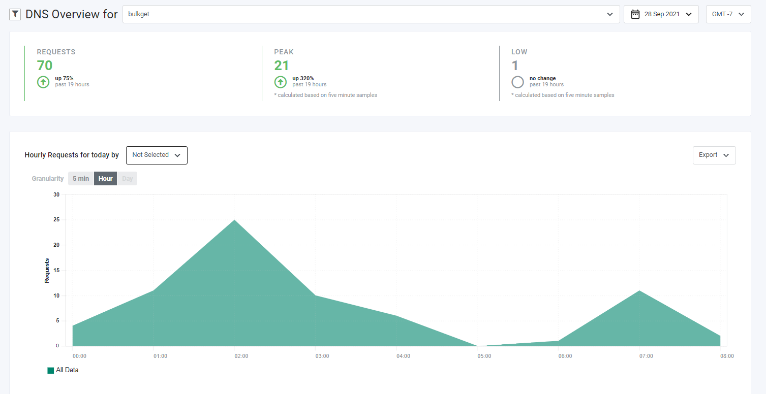
The DNS Overview report allows you to view DNS Traffic over time. You can use this report to track the number of requests for specific hostnames and accounts.

Report Specifications
| Specification | Description |
|---|---|
| Latency | Latency depends on the selected granularity. - 5 minutes: 5 to ten minutes - Hour: 1 hour + delta (approximately 5-10 minutes) - Day: 1 day + delta (approximately 5-10 minutes) |
| Granularity | 5 minutes, hour, day |
| Dimensions | Account, Hostname |
| Metrics - Summary Area | Requests, Peak, Low |
| Metrics - Chart | Requests |
| Delivery Mechanism | Realtime Reporting API |
| Associated API Endpoint(s) | /realtime-reporting-api/dns/- GET - Retrieves DNS report data based on query parameters- POST - Retrieves DNS report data based on the request body |
Selecting Accounts, Date Range, and Time Zones
You can make selections in the controls above the tab header:
-
DNS OVERVIEW FOR. Select one or more accounts to which you have access for cross-account analysis. Click the Select All button to select all accounts.You must select at least one account; otherwise, the default company is automatically selected, and a warning is displayed.
-
Date range. Pick from pre-set time frames or choose custom date ranges in the . Click the Apply button on custom ranges.
-
Time zone. The top five most commonly used timezones in are at the top of the . Scroll down for additional time zones.
Summary Area
For various statistics, the Summary Area shows the percent change for the selected reporting date range relative to the prior time period of the same length. For example, if you select This Month, the statistics show a comparison between this month’s data and the previous month’s.
Colors and arrows represent changes:
- An increase displays in green with an arrow pointing up.
- A decrease displays in red with an arrow pointing down.
- If there was no change from the previous period, the text is gray with an empty circle instead of an arrow.
- Percentage up or down is in bold text to the right of the arrow or empty circle.
- Information in gray text beneath the percentage up or down indicates the total date range covered minus any time remaining in the current period. For example, if you select Last 7 days as the reporting period and the current date is part of the past seven days, the past 13 days’ information is displayed.
Statistics in the Summary Area are:
| Statistic | Description |
|---|---|
| Requests | Total requests for the selected accounts, time period, and timezone. |
| Peak | Highest number of requests for the selected accounts, time period, and timezone. |
| Low | Lowest number of requests for the selected accounts, time period, and timezone. |
Filtering by Hostname
The filter icon (a funnel) on the left side of the tab header allows you to filter by hostname. The icon is a toggle that displays or hides the filter control.
-
Click the filter icon.
-
Make a selection in the subsequent Filter by dropdown.By default, the Hostname entry is unchecked. As such, data for all hosts is displayed in the chart.
-
If desired, select Hostname to display a with hostnames you can select for display in the chart.
-
Click the Apply button.
Selecting a Data Grouping
The chart can be further refined by selecting one of the Increment values:
- 5 min
- Hour
- Day
Exporting Data
To export data currently displayed in the chart, click the Export drop-down menu on the right above the chart; then choose an option:
- PowerPoint: Export to a PowerPoint file that contains a screenshot of the chart.
- CSV: Export data to a Comma-Separated Values (CSV) file that reflects the currently selected chart options.
After you choose an option, Control creates and downloads the report.
Toggling Chart Data
A legend below the chart identifies the chart content by color. The legend reflects the choices that you made in the Hostname Filter and the Grouping dropdown menu.
For example, if you choose Hostname in the dropdown menu, data for continents displays in the chart. Labels for the contents are displayed in the chart legend.
The legend labels are toggles that you can use to display or hide the corresponding chart data. By default, all labels are toggled on. Click a label to hide or show the corresponding data in the chart. Labels that are toggled off have a gray font color.
How Metrics Are Calculated
Summary
| Metric | Calculation |
|---|---|
| Requests | No calculation. Data provided by EdgeQuery. |
| Peak | No calculation. Data provided by EdgeQuery. |
| Low | No calculation. Data provided by EdgeQuery. |
Chart
| Metric | Calculation |
|---|---|
| Requests | No calculation. Data provided by EdgeQuery. |